I connected with a start-up business with the goal to revamp their branding and reimagine their current website. As my first real client-based project, I was excited to create something that not only would get the job done, but help them stand out as a company.

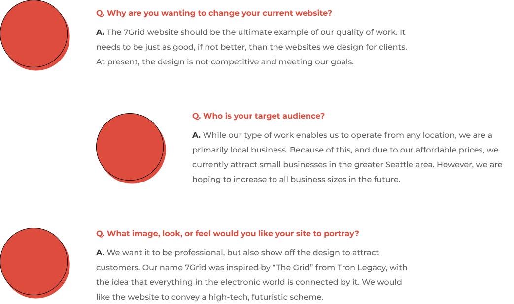
7Grid is a small digital agency made up of young professionals helping local businesses get a foothold in the digital world. Their services include website design, maintenance, and consultation. After launching an initial website to centralize company and service information, the team recognized that their digital presence no longer reflected their evolving capabilities or desired brand aesthetic. In a competitive and rapidly changing web design landscape, they needed a refreshed visual identity and updated site experience to better showcase their expertise and attract new clients.
Research and redesign 7Grid’s home, about, and services pages to create a cohesive, responsive experience across all device sizes.
Craft a refreshed logo and develop consistent brand language that clearly communicates 7Grid’s values and expertise.

Stakeholder Interviews
Market Research
Competitive Analysis

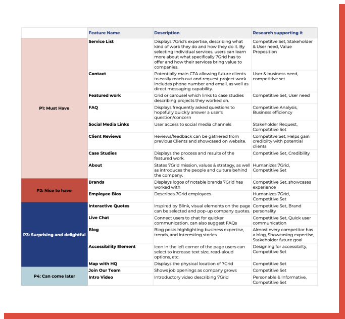
Feature Roadmap
Site Map
Task & User Flows

Moodboard
Logo & Style
Wireframes

High Fidelity Prototype
Usability Testing
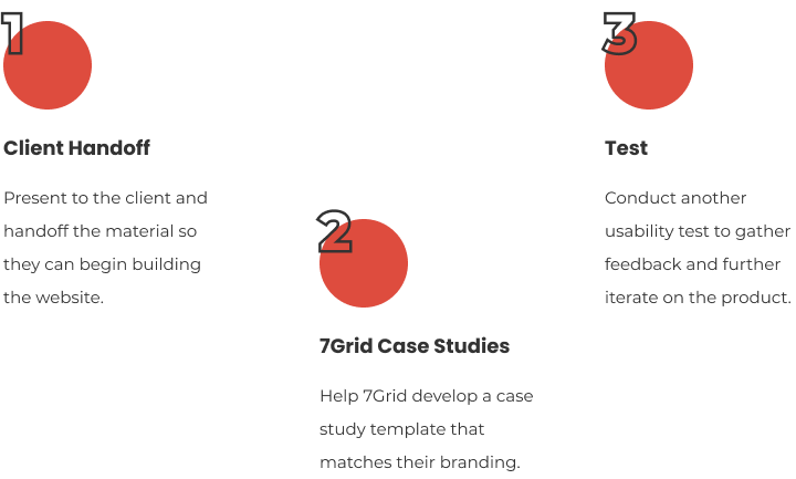
Client Handoff

Since 7Grid primarily serves local businesses, I began by reviewing digital agencies in the Seattle area. I then explored leading global agencies to gather additional inspiration and identify design patterns relevant to their business type.
Since 7Grid primarily serves local businesses, I began by reviewing digital agencies in the Seattle area. I then explored leading global agencies to gather additional inspiration and identify design patterns relevant to their business type.
After confirming features with the client, I began developing the site map! I wanted it to be as straightforward as possible, while meeting all user & stakeholder needs.
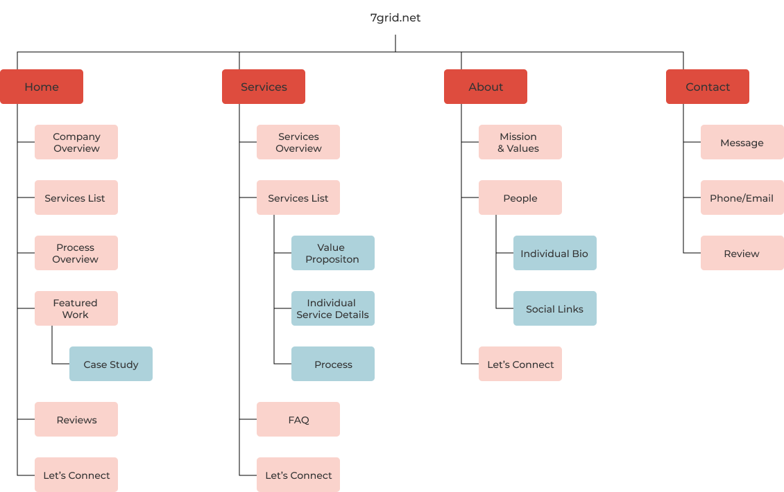
After confirming features with the client, I began developing the site map! I wanted it to be as straightforward as possible, while meeting all user & stakeholder needs.
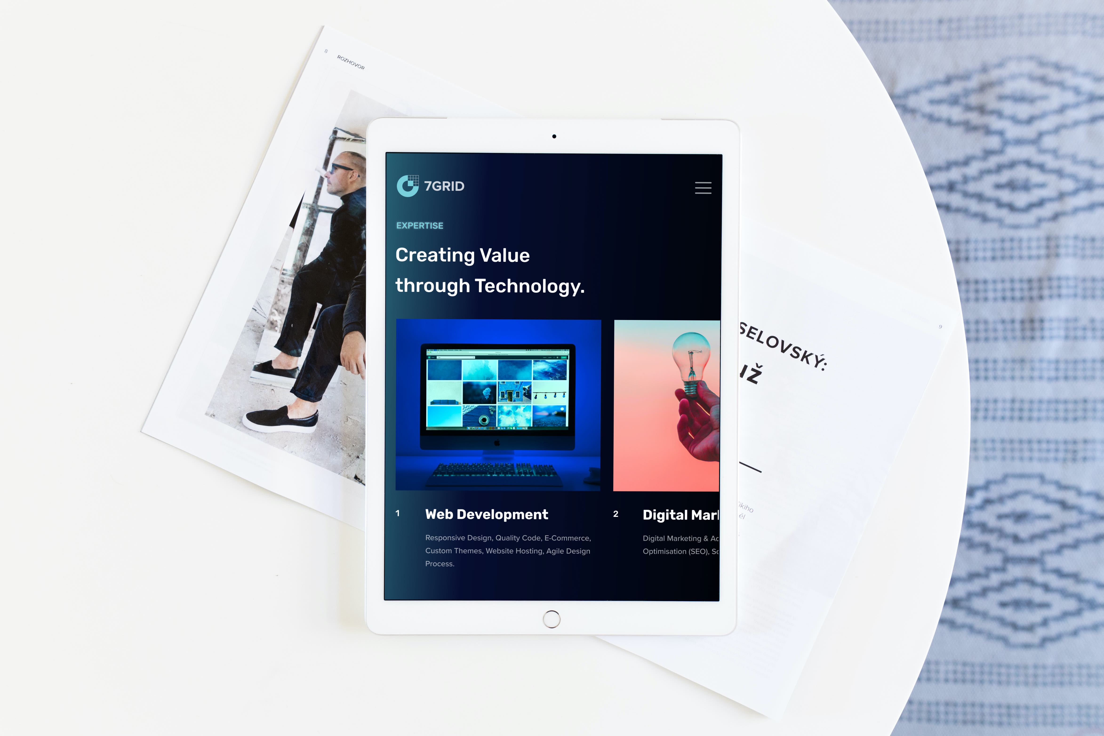
I presented the client with a dark scheme and a light scheme to select from. They both represented the provided keywords of High-Tech, Futuristic, and Light Speed, but the dark scheme leaned more towards retro futurism, while the light scheme was very clean and minimal.
They selected the dark scheme, which we felt best represented their name, 7Grid, and believed it would help them stand out from the competition.

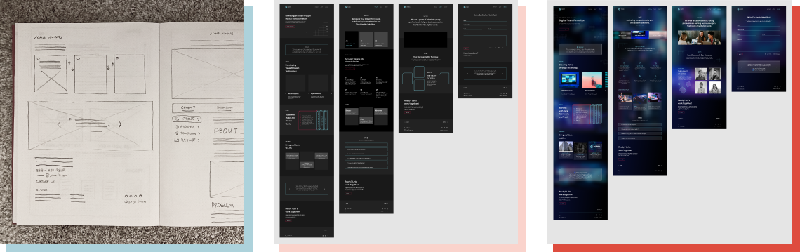
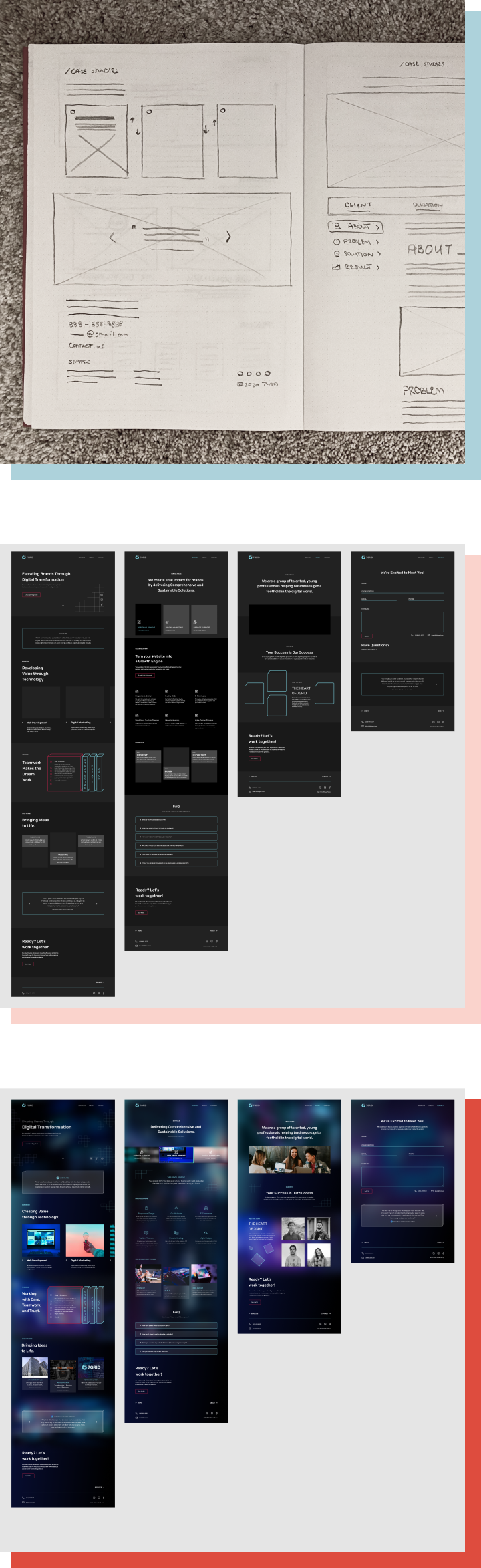
I began by sketching my ideas on paper, making sure to include everything from the site map. This first step gave me a starting point for the digital wireframes. Upon completing the Mid-Fidelity wireframes, I presented the layouts to the client to ensure the information was correct and their needs were met. I could then move forward in designing all the details for a High-Fidelity prototype.
I presented the client with a dark scheme and a light scheme to select from. They both represented the provided keywords of High-Tech, Futuristic, and Light Speed, but the dark scheme leaned more towards retro futurism, while the light scheme was very clean and minimal.
They selected the dark scheme, which we felt best represented their name, 7Grid, and believed it would help them stand out from the competition.
I began by sketching my ideas on paper, making sure to include everything from the site map. This first step gave me a starting point for the digital wireframes. Upon completing the Mid-Fidelity wireframes, I presented the layouts to the client to ensure the information was correct and their needs were met. I could then move forward in designing all the details for a High-Fidelity prototype.
I was inspired by pixels from retro video games and created an abstract 7 & G for the logomark. At the same time, I was looking for fonts to add to my style tile and came across Proxima Nova for the body text. I really liked the round, sans-serif style and ended up using the bolded version for the logotype as well.

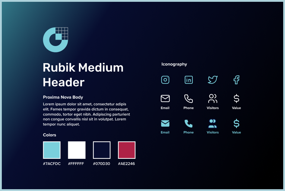
I was inspired by pixels from retro video games and created an abstract 7 & G for the logomark. At the same time, I was looking for fonts to add to my style tile and came across Proxima Nova for the body text. I really liked the round, sans-serif style and ended up using the bolded version for the logotype as well.
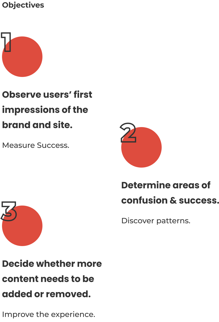
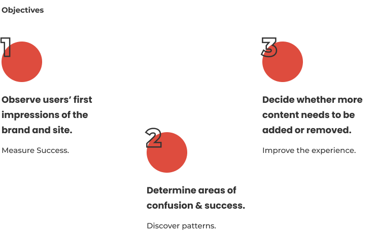
There were five participants total. Two were in person and three were remote over zoom. All the users talked me through their thoughts, feelings and processes as they navigated the site. Their task was to determine whether 7Grid seems like a respectable company and then move forward in hiring them as their digital agency.
There were five participants total. Two were in person and three were remote over zoom. All the users talked me through their thoughts, feelings and processes as they navigated the site. Their task was to determine whether 7Grid seems like a respectable company and then move forward in hiring them as their digital agency.

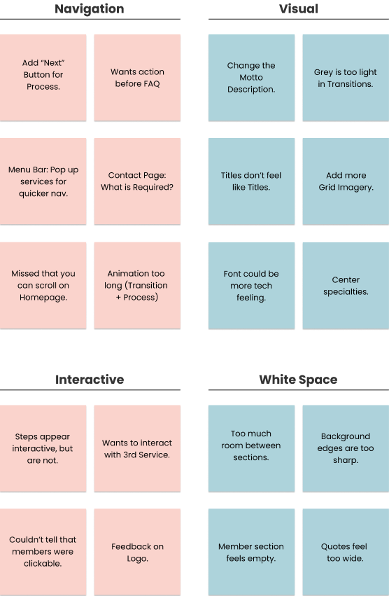
After user testing, I created an affinity map to help me sort, prioritize and rank the feedback. From there I developed the design into what it is today!
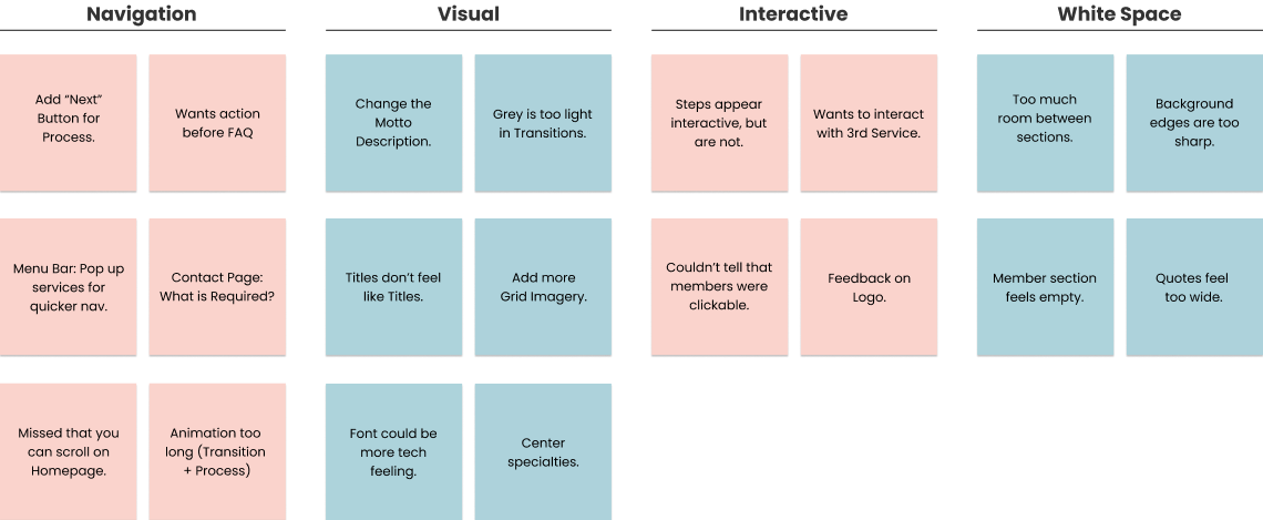
After user testing, I created an affinity map to help me sort, prioritize and rank the feedback. From there I developed the design into what it is today!