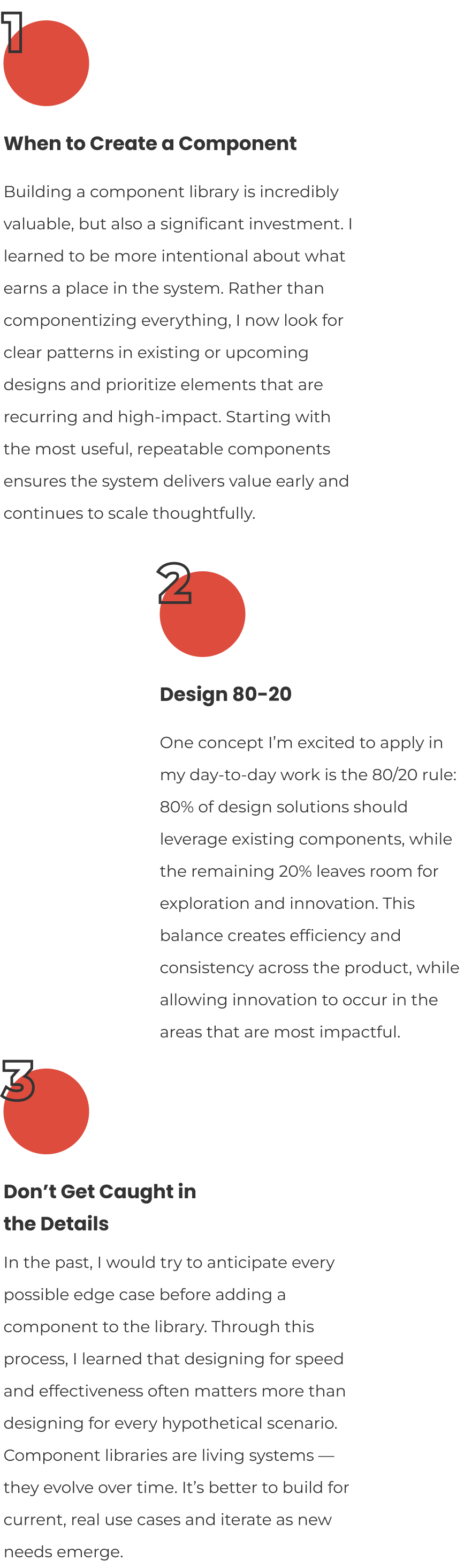
As a continuous learning opportunity, I enrolled in the Dribbble Design Systems course to deepen my understanding of designing for efficiency, consistency, and scalability. This case study highlights my capstone project and the key learnings that continue to shape my approach to system-driven design.

For the Dribbble Design Systems course, my capstone challenged me to build a scalable design system for a fictional galactic transit corporation: IPTS.
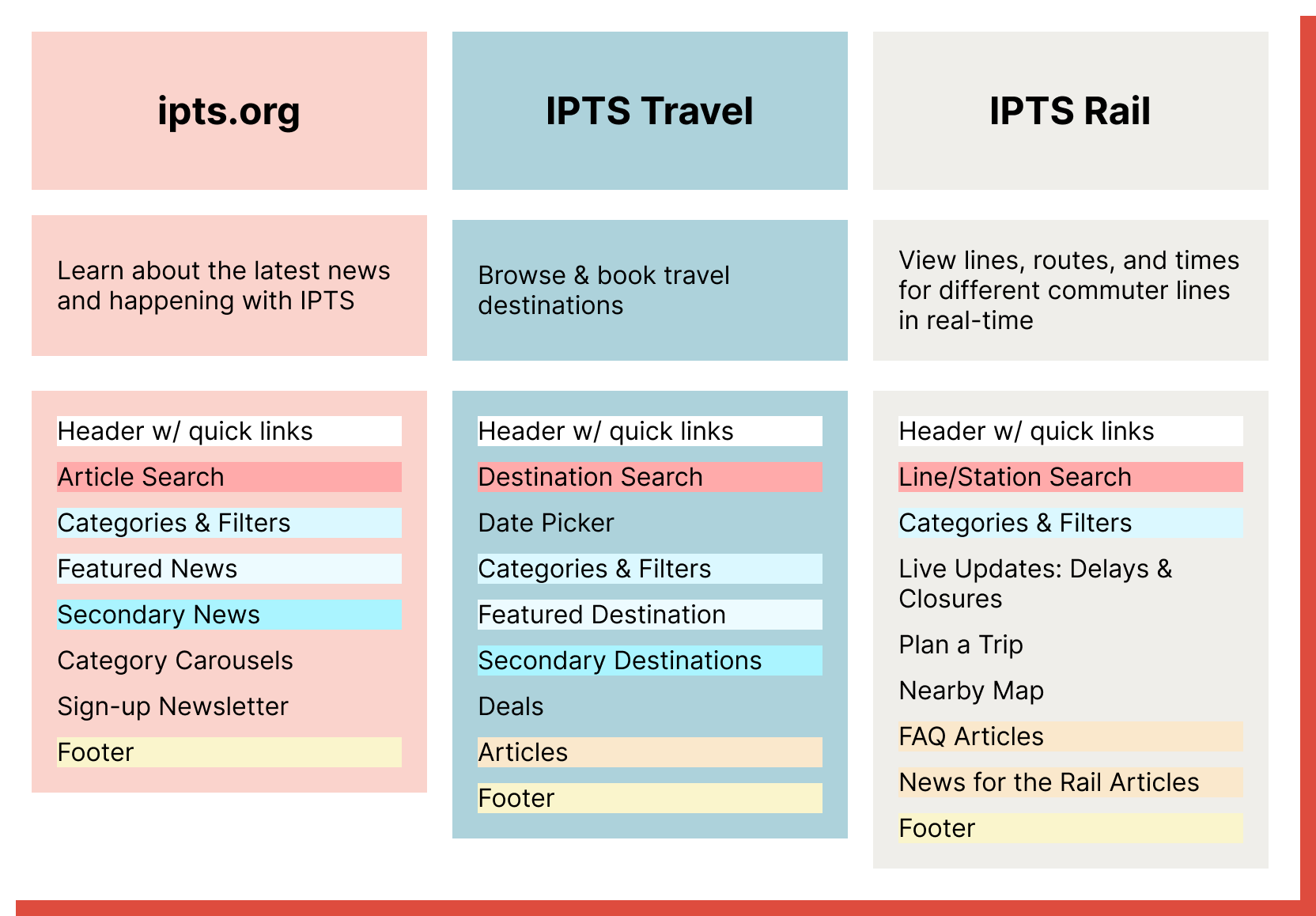
The IPTS ecosystem spans three distinct websites — ipts.org, IPTS Travel, and IPTS Rail — each serving different user needs within the same product universe. My objective was to identify shared patterns, create reusable components, and document them in a way that ensured consistency across the entire experience.
To put the system to the test, I then executed a product-wide rebrand. This final phase measured what truly matters in systems work: how efficiently the design could scale, adapt, and evolve without rebuilding from scratch.
Identify and create at least five reusable components that can scale across the IPTS websites, promoting consistency in style and usability patterns.
Design for resiliency so the webpages easily adapt to a rebrand.

Brand Research
Competitive Set

Feature List
Component Candidates

Style Guide
Hi-Fi Wireframes

ZeroHeight Documentation
Rebrand Challenge

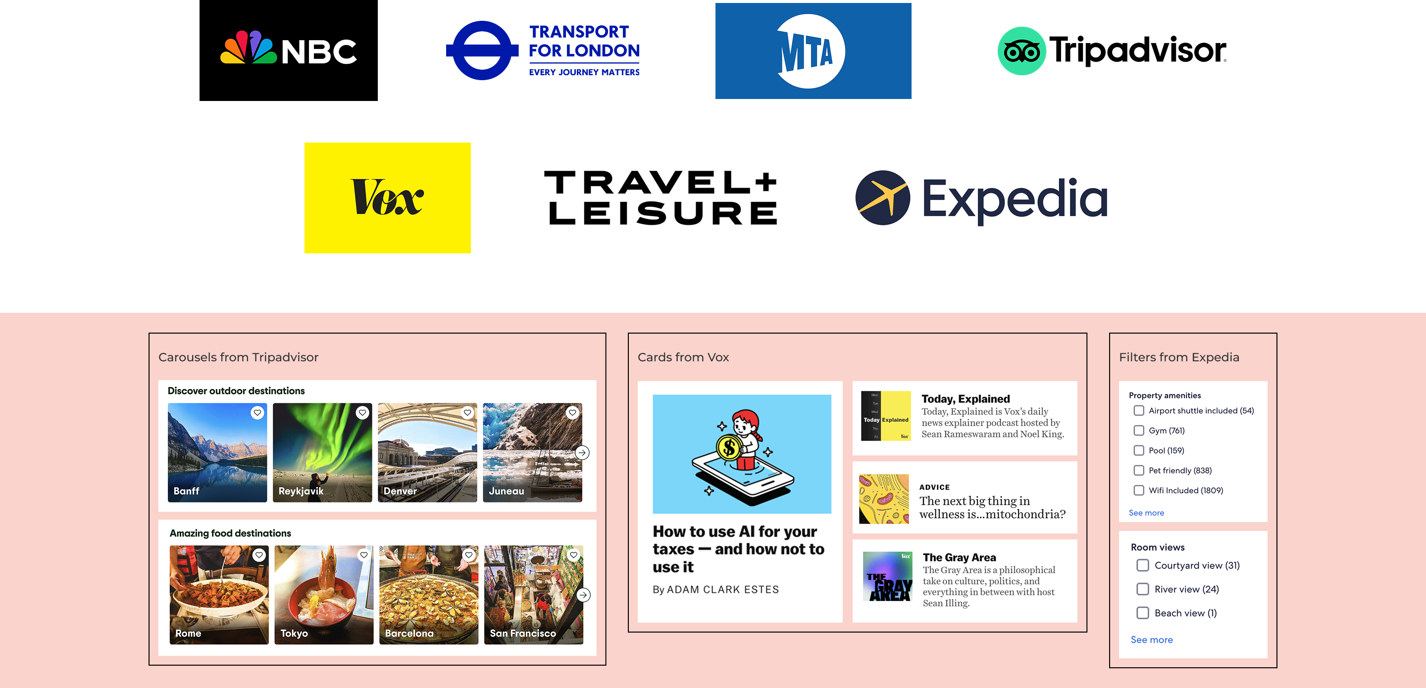
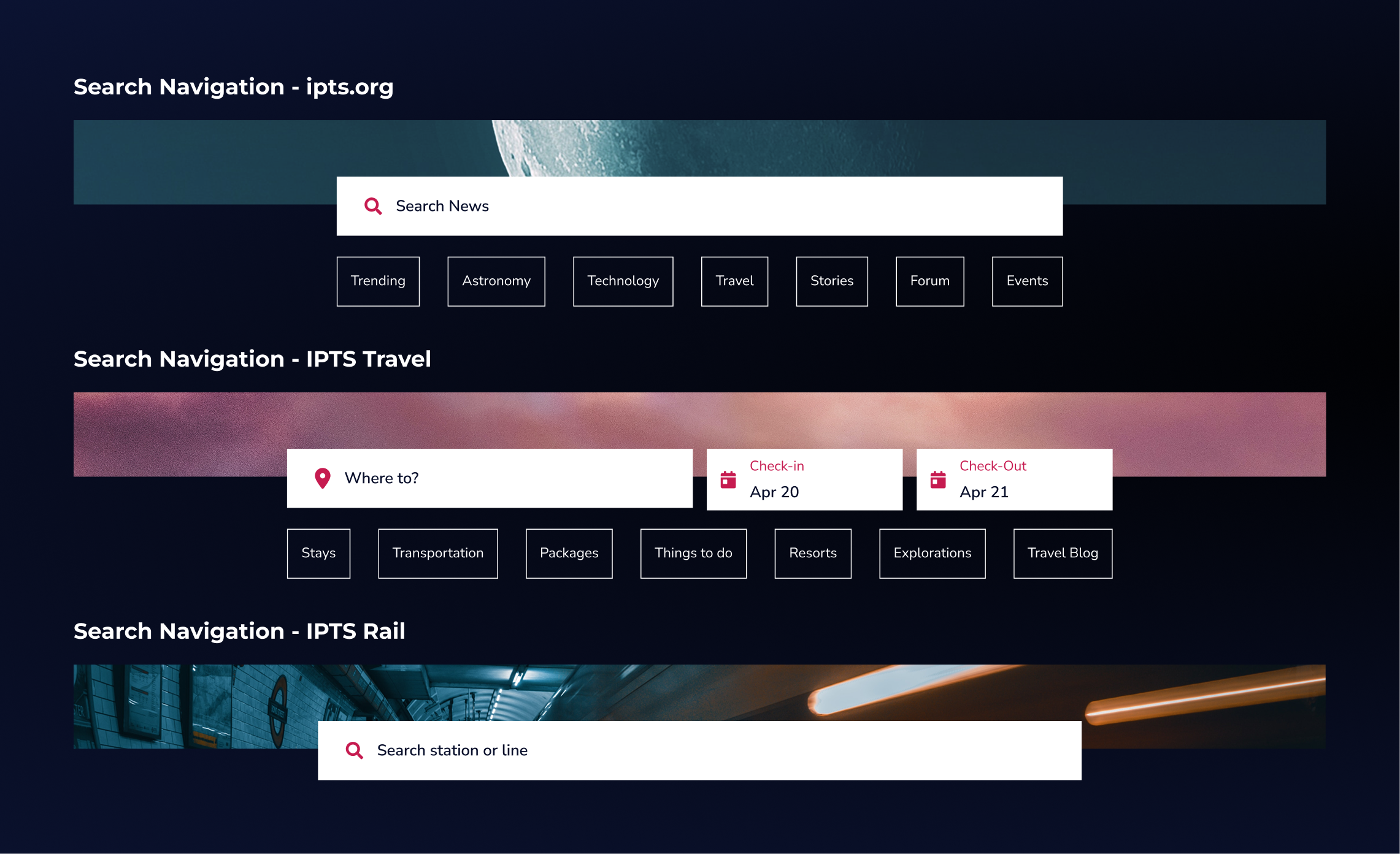
I reviewed news, travel, and rail/ticketing websites to identify common design patterns, interaction models, and content structures across complex, information-heavy platforms. By studying how these industries approach search, booking flows, navigation, and content hierarchy, I was able to extract scalable patterns and translate them into foundational components, which helped informed the core structure and feature set needed to support a cohesive space travel website.
I reviewed news, travel, and rail/ticketing websites to identify common design patterns, interaction models, and content structures across complex, information-heavy platforms. By studying how these industries approach search, booking flows, navigation, and content hierarchy, I was able to extract scalable patterns and translate them into foundational components, which helped informed the core structure and feature set needed to support a cohesive space travel website.
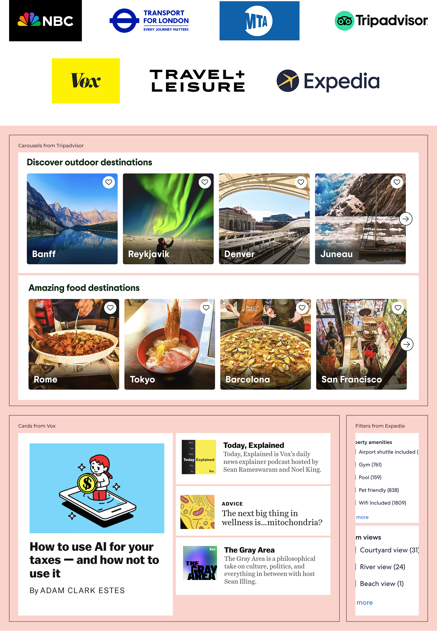
From the competitive set, I created an initial feature list for each website. This exercise helped me quickly identify overlapping functionality and uncover components that could be reused consistently across all three sites.
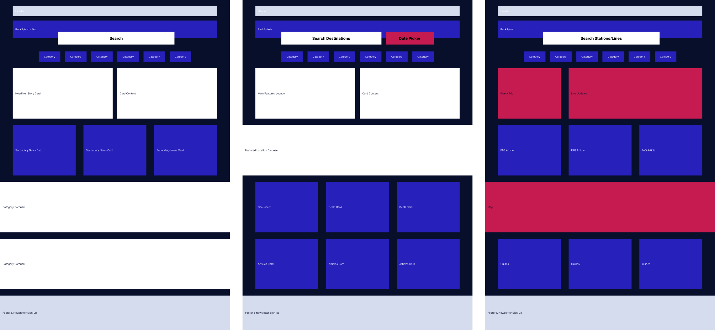
For many designers, myself included, it’s tempting to jump straight into high-fidelity mockups. Instead, I prioritized speed by starting with basic placeholder shapes for each feature. This approach helped me quickly visualize components that could scale consistently across all three webpages.

From the competitive set, I created an initial feature list for each website. This exercise helped me quickly identify overlapping functionality and uncover components that could be reused consistently across all three sites.
For many designers, myself included, it’s tempting to jump straight into high-fidelity mockups. Instead, I prioritized speed by starting with basic placeholder shapes for each feature. This approach helped me quickly visualize components that could scale consistently across all three webpages.
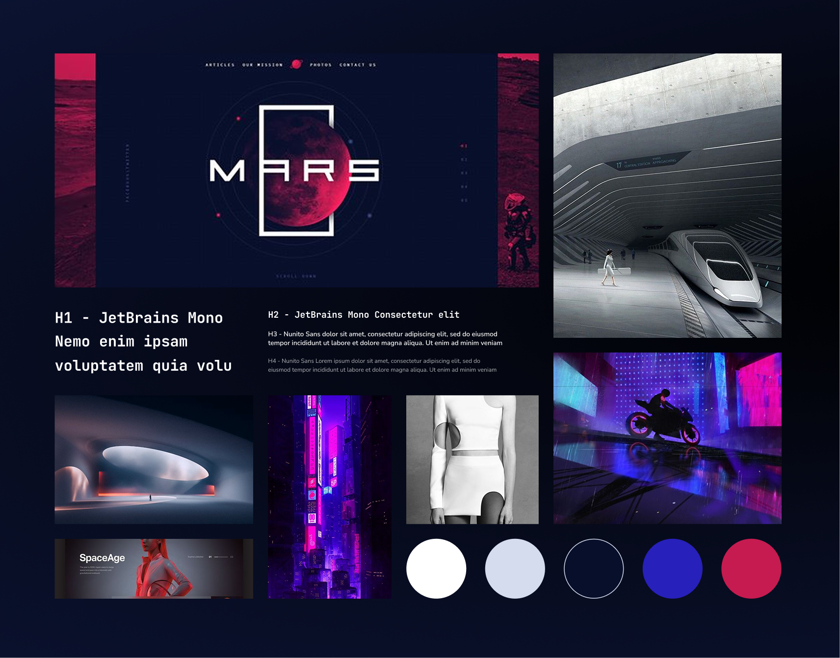
While I was provided logos for this project, the imagery, colors and text styles were all in my control. I wanted something retro-futuristic, atmospheric, and exploratory. A dark scheme also felt very appropriate for our outer space subject matter.After creating the mood board, I drew out colors and text styles and saved them in the figma color & text libraries. This will make it easy to switch up the styles once the company-wide rebrand occurs.
After creating the mood board, I drew out colors and text styles and saved them in the figma color & text libraries. This will make it easy to switch up the styles once the company-wide rebrand occurs.
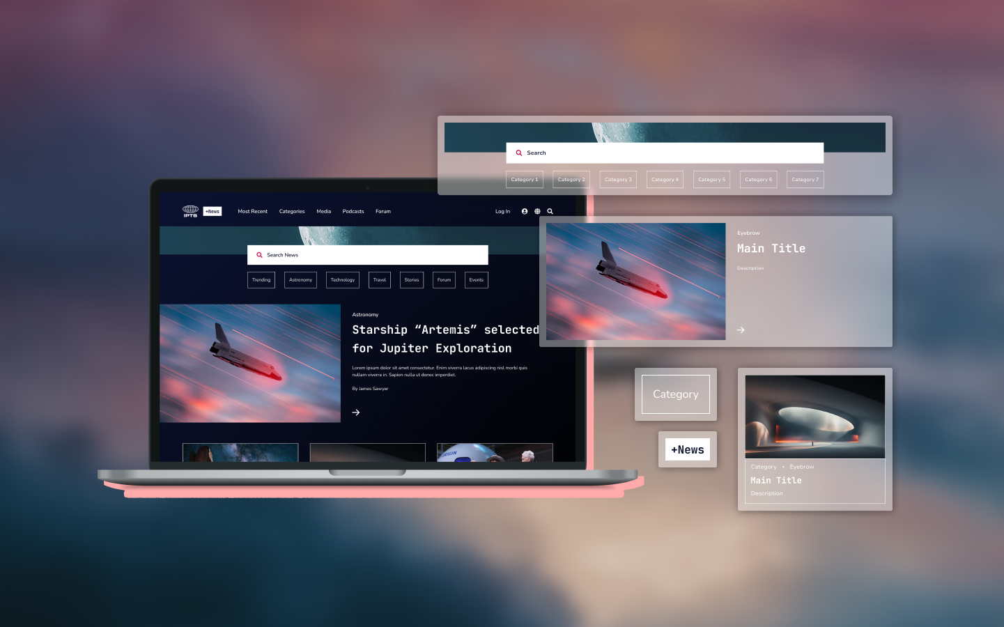
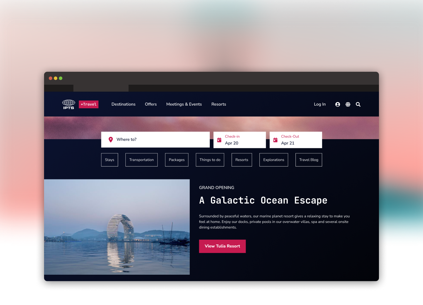
With the style guide established, I moved into high-fidelity designs. Because I had already identified reusable components in the lo-fi wireframes, I intentionally designed them to flex across different page types. I began with the most complex variation of each component—such as the IPTS travel search module, which includes date pickers alongside the search bar—to ensure the core component accounted for all necessary, customizable atoms from the start.
With the style guide established, I moved into high-fidelity designs. Because I had already identified reusable components in the lo-fi wireframes, I intentionally designed them to flex across different page types. I began with the most complex variation of each component—such as the IPTS travel search module, which includes date pickers alongside the search bar—to ensure the core component accounted for all necessary, customizable atoms from the start.
I worked on all three webpages simultaneously, identifying components that could be reused and adapted for each page. This approach not only sped up the design process but also ensured visual cohesion across the entire site.
Once a component was designed, I documented it in Zeroheight, outlining clear descriptions and usage guidelines. For each component type, I also created a dedicated case study section that “chronicled” how it was implemented in the IPTS ecosystem. These case studies serve as practical, step-by-step examples, making it easier for new contributors to understand not just what the component is, but how to apply it effectively within the product.
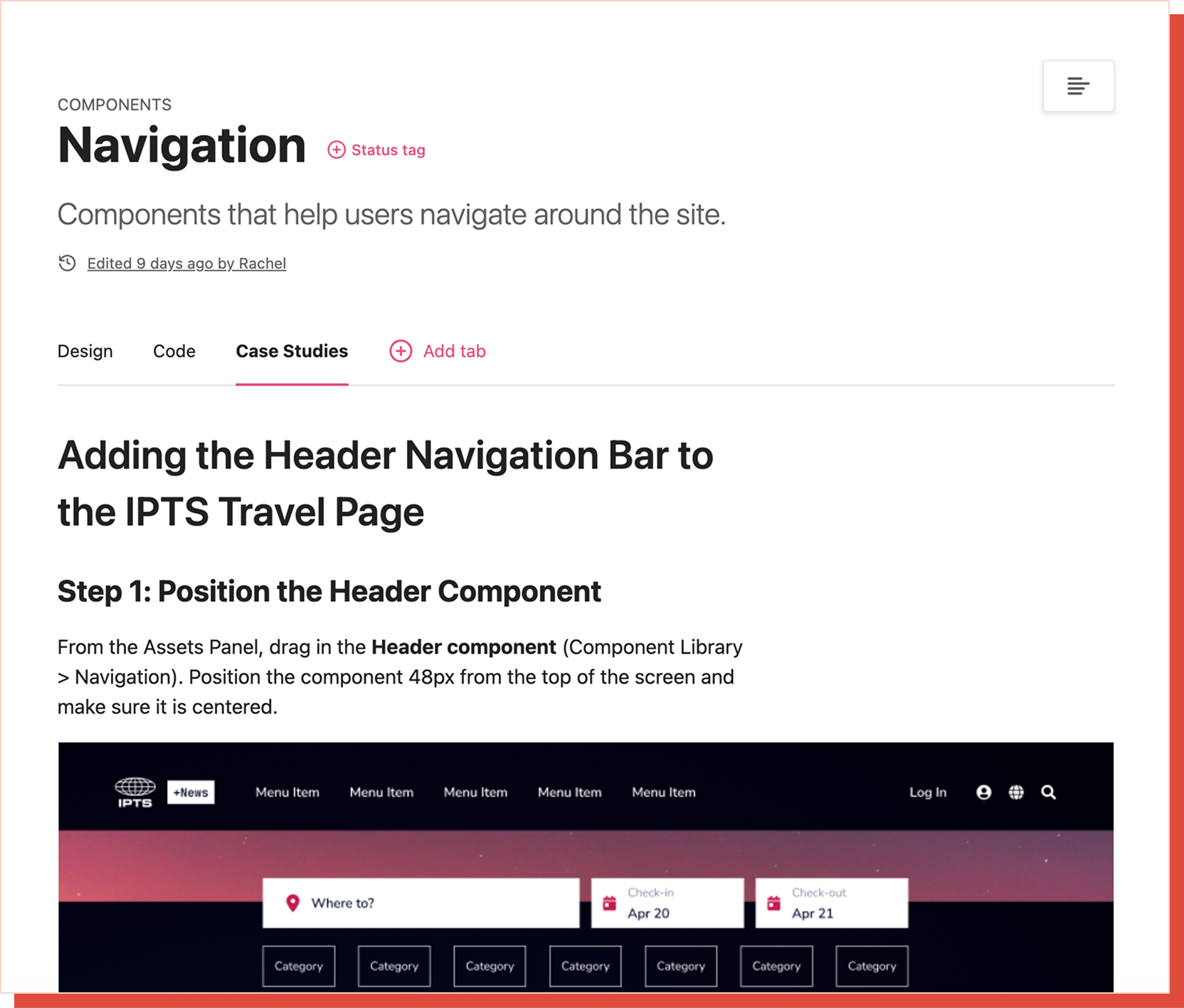
Once a component was designed, I documented it in Zeroheight, outlining clear descriptions and usage guidelines. For each component type, I also created a dedicated case study section that “chronicled” how it was implemented in the IPTS ecosystem. These case studies serve as practical, step-by-step examples, making it easier for new contributors to understand not just what the component is, but how to apply it effectively within the product.
To test the resiliency of my design system, I was provided with the scenario of IPTS deciding to rebrand as “shuddle” to appear friendlier and target a younger demographic. I was given a new style guide and logos to work with and began the process of adapting my website designs.
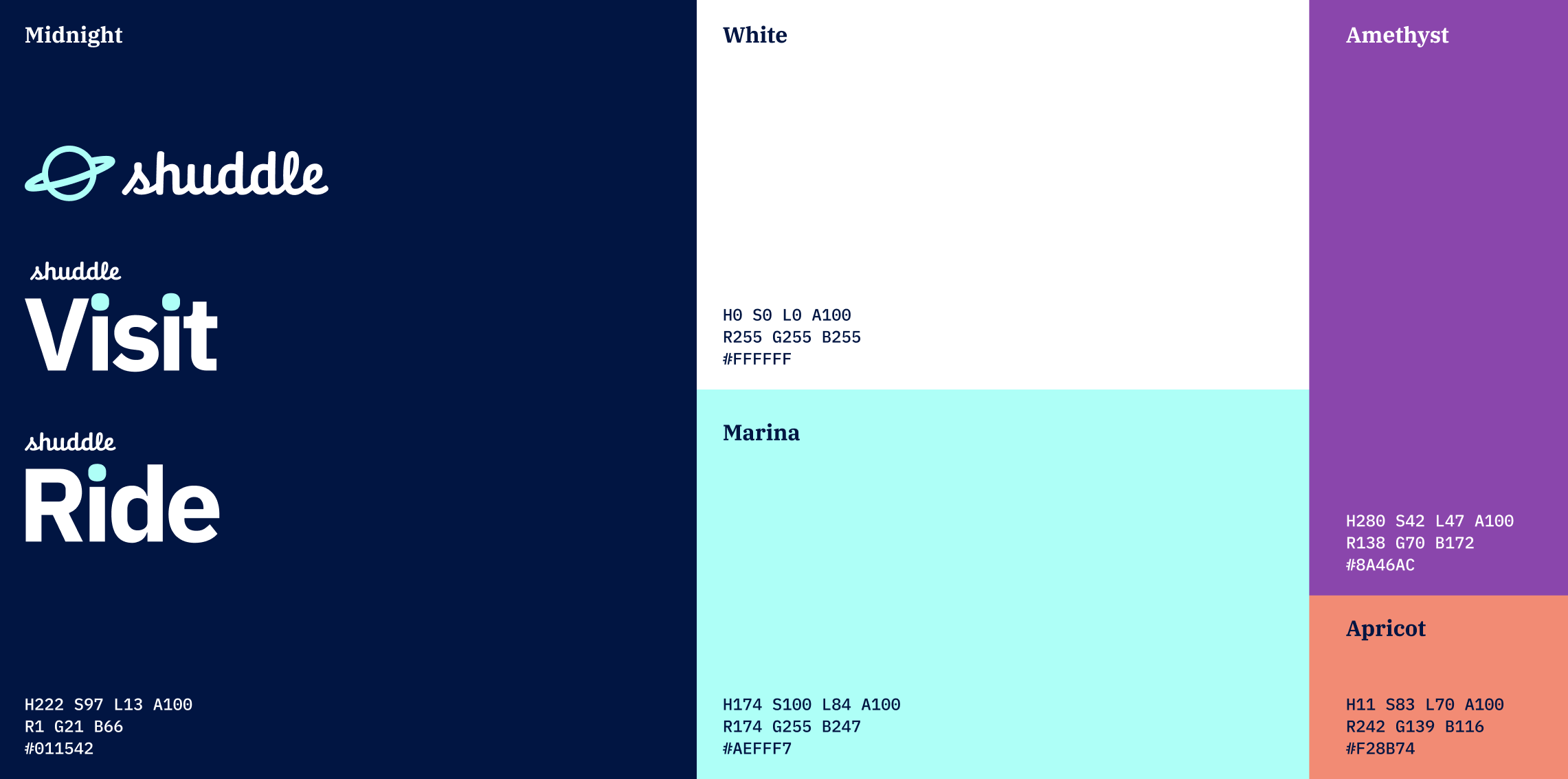
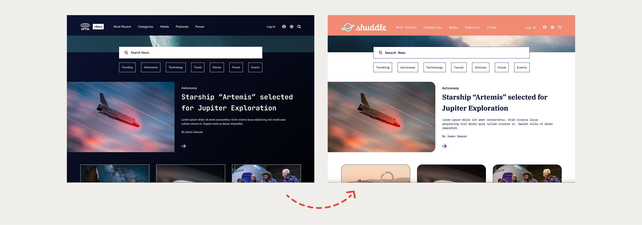
To test the resiliency of my design system, I was provided with the scenario of IPTS deciding to rebrand as “shuddle” to appear friendlier and target a younger demographic. I was given a new style guide and logos to work with and began the process of adapting my website designs.