In the pace of everyday life, it’s easy to overlook the places around us. GoLocal was designed to help people explore their area more intentionally and feel more connected to where they live, with research guiding a thoughtfully crafted, holistic app experience.

I’m sure each of us have thought at some point “where has the time gone?” or “time has sure flown by!” Personally, I have lived in four different states over the past four years and I can’t help but wonder why I didn’t spend more time fully taking advantage of the city I was in. The problem is, as the days go by, we start to develop a routine and exploration becomes less of a priority. I wanted to help people make the most of whatever city they’re living in so they won’t think back and wonder why they didn’t do more during that season in their life.
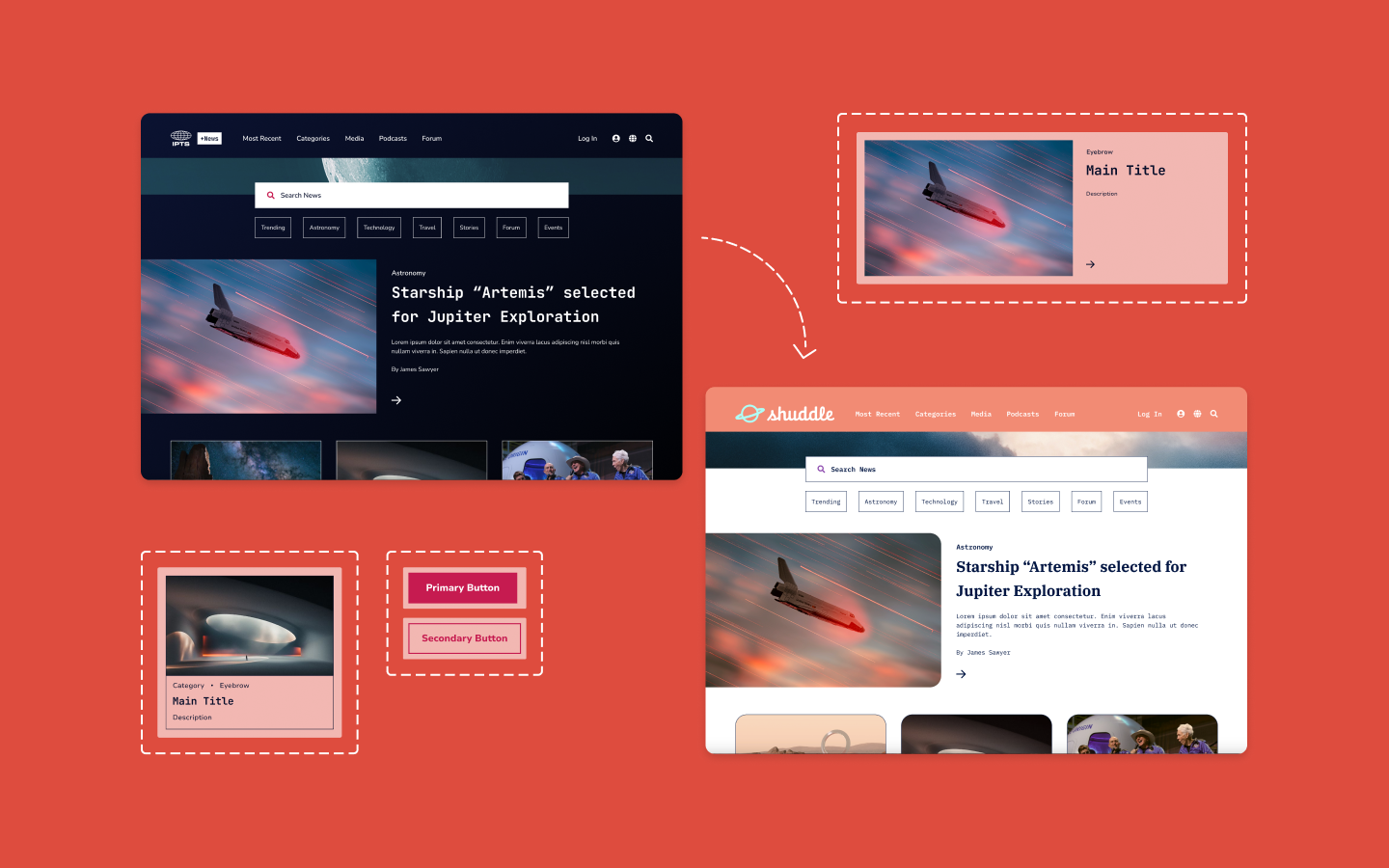
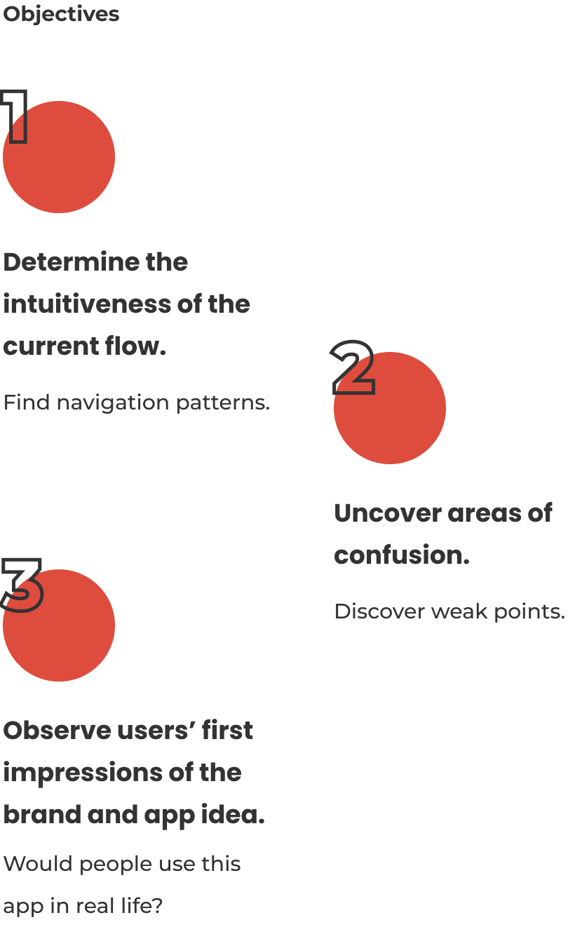
Transform research insights into a thoughtfully crafted high-fidelity prototype that brings the core user journey to life.
Create a brand identity that captures the spirit of curiosity, connection, and local discovery.

User Interviews
Competitive Analysis
Secondary Research
Empathy Map

HMW & POV
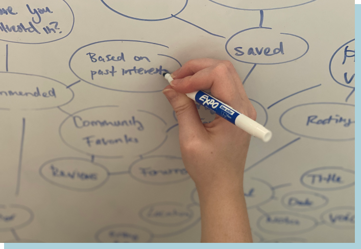
Mind Map
Feature Roadmap
User Flow

Mood Board
Style Guide
Sketches
Wireframes

Hi-Fi Prototype
Usability Testing
Affinity Map
Iteration

I organized the findings into four primary stages of the experience journey. This structure clarified recurring patterns and unique approaches, revealing opportunity areas that shaped the app’s direction.

I organized the findings into four primary stages of the experience journey. This structure clarified recurring patterns and unique approaches, revealing opportunity areas that shaped the app’s direction.
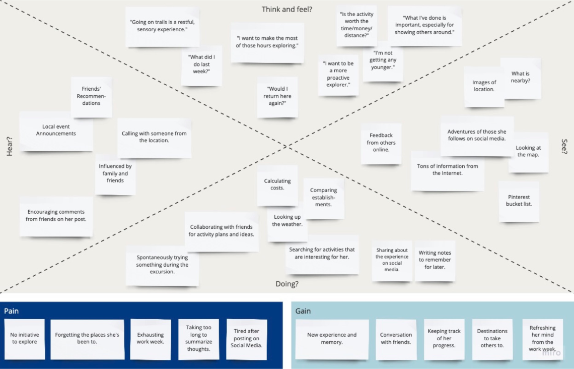
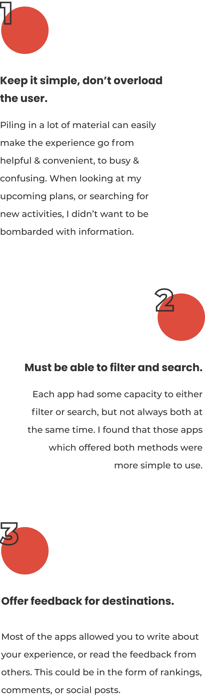
Mapping the interviewees' inputs and influences revealed the tension between inspiration and overwhelm — users were motivated to explore, yet often stalled by fatigue, too much information, or difficulty recalling past experiences. Seeing their pains and gains side by side highlighted clear opportunity areas: simplifying discovery, reducing planning friction, and helping users meaningfully document their experiences. This exercise provided a grounded foundation for product direction and feature prioritization.
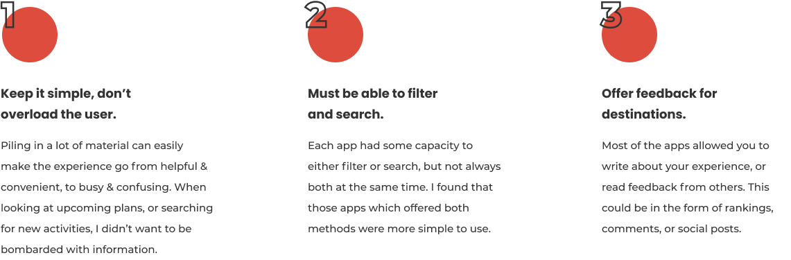
One of the main problems I want to solve is helping people feel like time isn’t quickly passing them by. I was happy to see how some of the tips provided support my local experience app idea, while tackling this issue of lost time.

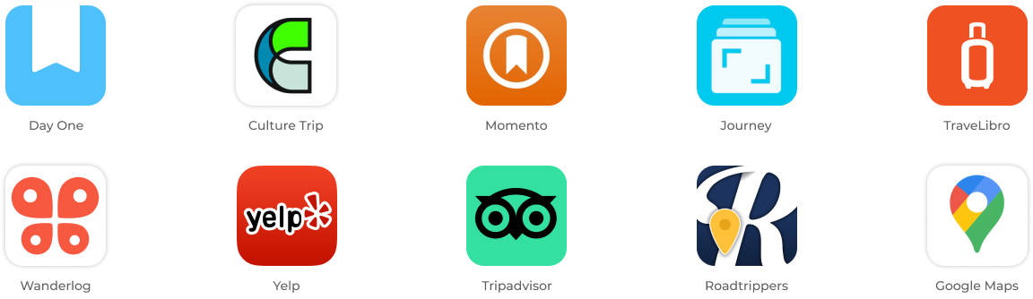
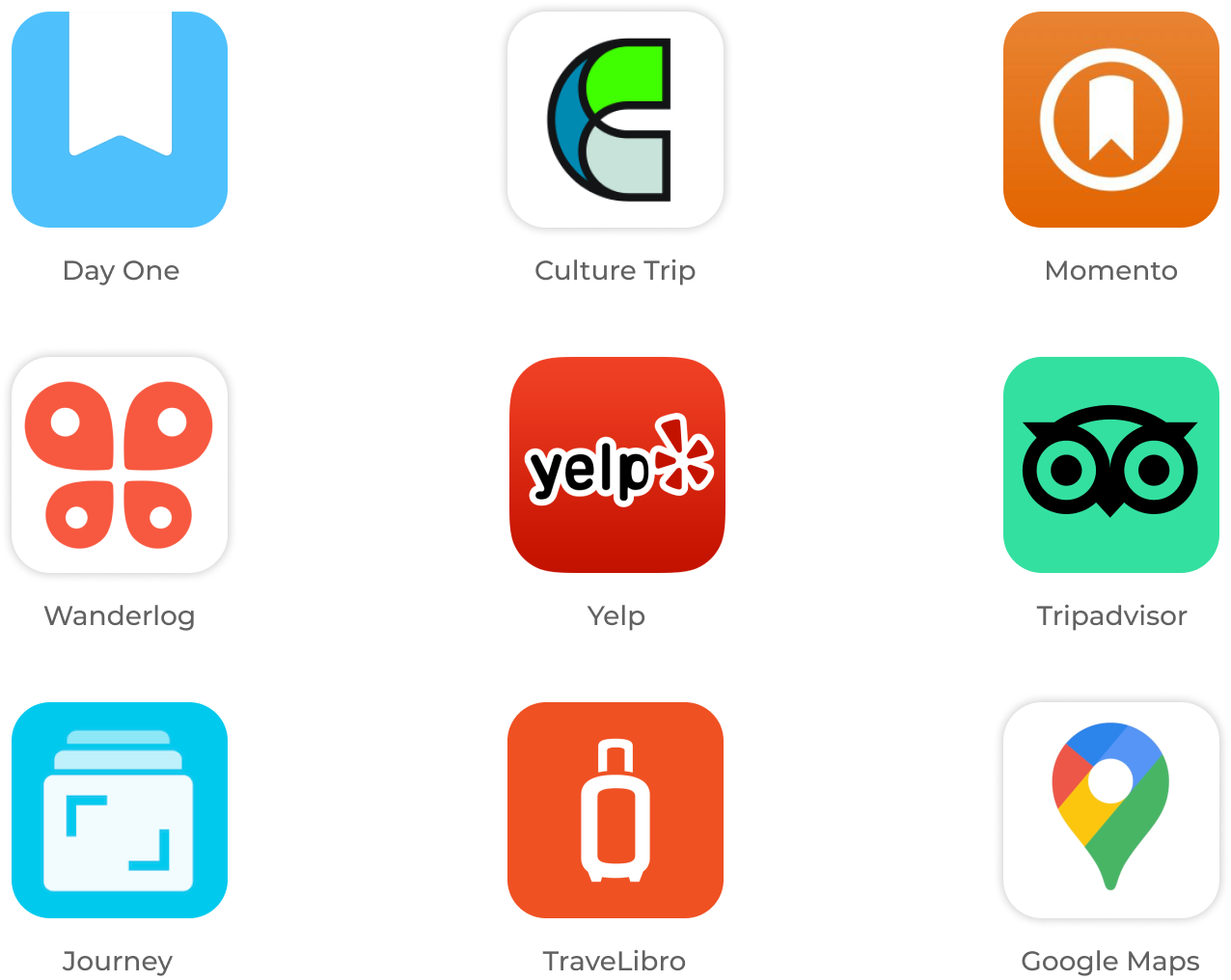
Through a google search, I looked for the best ranked journal apps, travel journal apps, and trip planning apps. I then tested them out, writing out the pros and cons for each.
Mapping the interviewees' inputs and influences revealed the tension between inspiration and overwhelm — users were motivated to explore, yet often stalled by fatigue, too much information, or difficulty recalling past experiences. Seeing their pains and gains side by side highlighted clear opportunity areas: simplifying discovery, reducing planning friction, and helping users meaningfully document their experiences. This exercise provided a grounded foundation for product direction and feature prioritization.
One of the main problems I want to solve is helping people feel like time isn’t quickly passing them by. I was happy to see how some of the tips provided support my local experience app idea, while tackling this issue of lost time.
Through a google search, I looked for the best ranked journal apps, travel journal apps, and trip planning apps. I then tested them out, writing out the pros and cons for each.
Highlighting the user needs, the POV Statements organized my user research into practical scenarios I must design for.

How Might We...
...help users find experiences that fit their personality & mood?
...allow users to sort through information easily?
...inspire & assist users in planning activities?
...make creating journal entries a fun and satisfying experience?
Highlighting the user needs, the POV Statements organized my user research into practical scenarios I must design for.
How Might We...
...help users find experiences that fit their personality & mood?
...allow users to sort through information easily?
...inspire & assist users in planning activities?
...make creating journal entries a fun and satisfying experience?
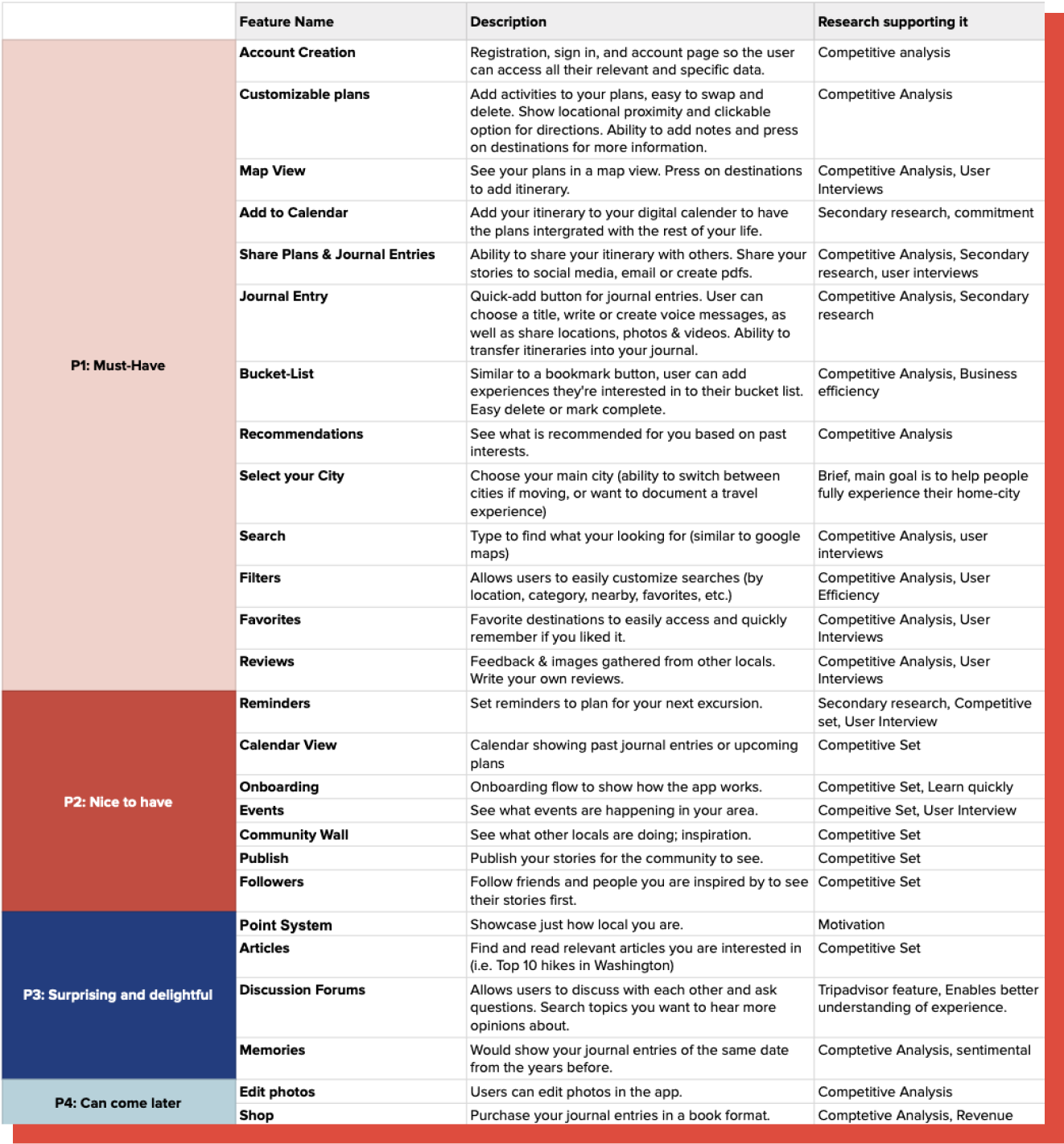
This feature roadmap began as a competitive research–driven exploration of the app’s potential. Following user interviews and insight synthesis, I iterated on the roadmap to ensure the feature set more directly addressed validated user needs and opportunity areas.
Using Lucidchart, I mapped a user flow outlining the app’s core journey — Find, Save, Plan, Experience, and Document. Visualizing these stages helped clarify the structure of the prototype and how the features from the roadmap would connect across the experience.
I searched for images which conveyed: Summer, Fun, Bright, Adventure, and a mixture of Nature and City.

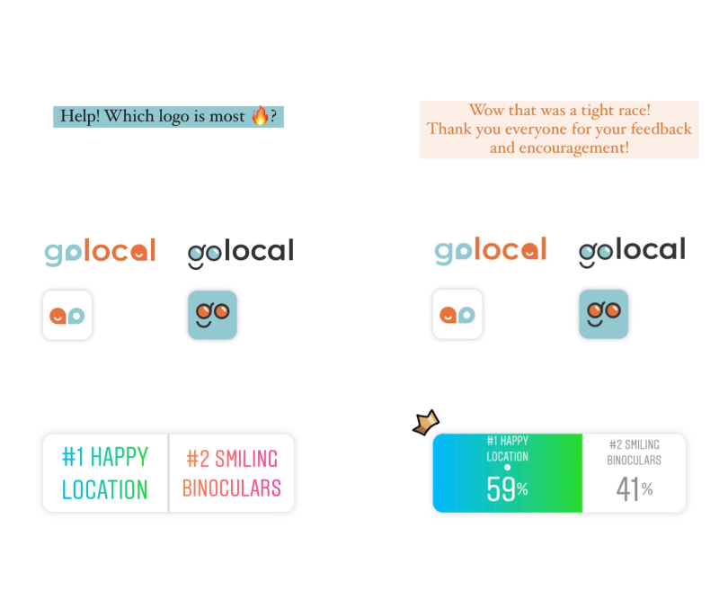
I decided on the name “GoLocal” because it suggests action and advocates for local experiences. From there, I went into ideation mode and narrowed it down to two options. I had a very hard time selecting the final iteration that I took it to Instagram! The “Happy Location” option took the crown for its clean and friendly aesthetic.
I searched for images which conveyed: Summer, Fun, Bright, Adventure, and a mixture of Nature and City.
I decided on the name “GoLocal” because it suggests action and advocates for local experiences. From there, I went into ideation mode and narrowed it down to two options. I had a very hard time selecting the final iteration that I took it to Instagram! The “Happy Location” option took the crown for its clean and friendly aesthetic.

I conducted usability testing with the original interview participants, spanning a 30-year age range (19–49). While all participants successfully completed the tasks, the app proved more intuitive for younger users. Hearing participants think aloud as they navigated the prototype provided valuable insight into their decision-making, expectations, and moments of friction.
I conducted usability testing with the original interview participants, spanning a 30-year age range (19–49). While all participants successfully completed the tasks, the app proved more intuitive for younger users. Hearing participants think aloud as they navigated the prototype provided valuable insight into their decision-making, expectations, and moments of friction.


After user testing, I created an affinity map to help me sort, prioritize and rank the feedback. From there I developed the design into what it is today!
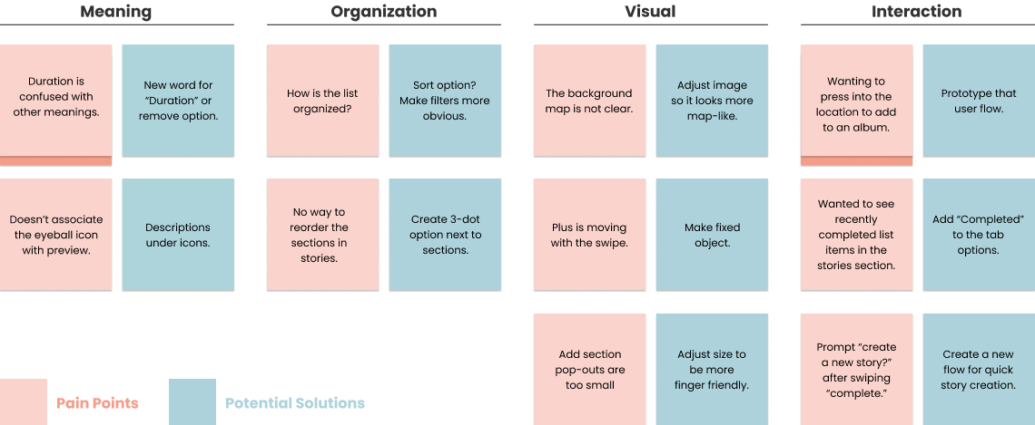
After user testing, I created an affinity map to help me sort, prioritize and rank the feedback. From there I developed the design into what it is today!